HEAR THE CALL.
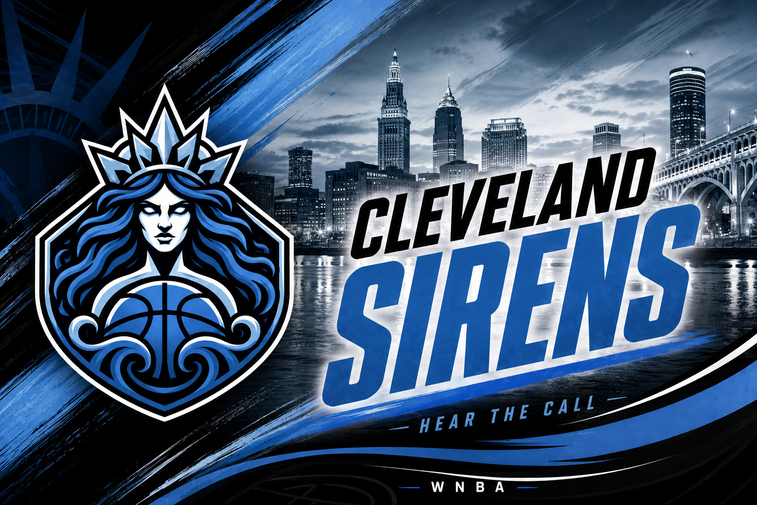
The Sirens brand gives Cleveland a WNBA identity that can stand apart from the Cavaliers while still connecting to the city's lakefront and women's basketball history.
NAME + LOGO + IDENTITY
Why Sirens works.
This isn't a Rockers reboot. The identity pulls from Lake Erie and the mythic idea of an unmistakable call — a visual and verbal language built around water, movement, sound and feminine power.
Two blue tones connect the identity to Cleveland's lakefront; the lighter blue also nods to the old Rockers era.
The Siren's flowing-hair details reference both the five Great Lakes and the five positions on a basketball team.
Curves and swashes around the figure are designed to feel like the call reverberating outward.
Water and mythology give the team a world the Cavaliers do not already own.
THEN → NOW
Cleveland's WNBA story has two chapters.
Cleveland Rockers
The Rockers were one of the WNBA's original eight franchises. Their history belongs to Cleveland, but the Sirens arrive as a new franchise rather than a renamed continuation.
Cleveland Sirens
A new ownership era, new mythology and a modern identity built for the league's expansion boom.
ROAD TO OPENING NIGHT